
Visualize JMA GPV Weather Data in QGIS
What you'll learn
- What GPV data is
- How to work with JMA GPV data in QGIS
Recommended for
- Anyone who wants to work with weather data in QGIS
- Anyone who wants to create weather maps like those in weather forecasts in QGIS
Introduction
Have you heard of GPV data? The results of the numerical weather prediction and ensemble forecasts run by the Japan Meteorological Agency (JMA) are published as GPV data. Weather forecasts are made from this data, usually with specialized software such as WGRIB2. However, QGIS can also open GPV data and visualize it.
This article shows how to open and visualize GPV data in QGIS.
What is GPV data?
GPV stands for “Grid Point Value” and is a general term for data that places a value at each grid point.
JMA's GPV data comes from numerical weather prediction run on a supercomputer, using observed values such as temperature and pressure obtained from various weather observations. The model outputs weather elements such as temperature and wind from the initial time to several hours ahead, and these elements are published as GPV data.
GPV data has a grid in the vertical direction as well as the horizontal direction, so it also contains weather elements for each altitude (each pressure level).

Get GPV data
GPV data provided by JMA can usually be obtained for a fee from the “Japan Meteorological Business Support Center,” and it can also be purchased from private weather companies. For research and education, it is also available from the “Database of the Humanosphere” of the Research Institute for Sustainable Humanosphere, Kyoto University.
This article uses the Meso-Scale Model GPV sample data published by JMA as an example of working with GPV data in QGIS.

The data specifications are described in detail in JMA's information catalog. As an example, a downloaded file name is structured as follows.

- Forecast initial time: 0:00 UTC on December 5, 2017
- Numerical model type: MSM (Meso-Scale Model). Others include GSM (Global Spectral Model) and LFM (Local Forecast Model).
- Level:
L-pallindicates pressure levels. (Lsurfindicates surface conditions.) - Forecast time: Indicates how many hours after the initial time the values are for.
In other words, this data is a Meso-Scale Model product, with an initial time of 0:00 UTC on December 5, 2017, that outputs surface conditions from 0 to 15 hours ahead.
The Meso-Scale Model entry in JMA's information catalog shows that it holds information such as temperature, relative humidity, and wind (east-west wind and north-south wind) at the surface and at each pressure level.

Add GPV data
There are two ways to load GPV data into QGIS: as a raster layer or as a mesh layer.
A raster layer stores a fixed value in each pixel cell, so it is static grid data.
A mesh layer divides data into a grid and visualizes the data on each grid face and at its vertices. It is similar to raster data in that it represents areas, but a mesh layer can store vector values at the grid vertices and a time component, so it supports a wider range of representations than a raster.
For more about raster layers, see the following article.
Load as a raster layer
To load the data as a raster layer, choose Layer → Add Layer → Add Raster Layer from the menu bar.

The Data Source Manager opens. In the Source section, click the ... button on the right and select the GPV data you want to open. Then click Add in the Data Source Manager to add the data.


Load as a mesh layer
To load the data as a mesh layer, choose Layer → Add Layer → Add Mesh Layer from the menu bar.

The Data Source Manager opens. In the Source section, click the ... button on the right and select the GPV data you want to open. Then click Add in the Data Source Manager to add the data.


View the data information
From here, the visualization steps use the data added as a raster layer.
Right-click the raster layer in the Layers panel and select Properties. Then click the Information tab to see information about the data.
For example, the Information from provider section shows the extent of the data and the number of pixels vertically and horizontally. The bands are divided by pressure level, weather element, and forecast time, and this sample data is divided into 552 bands.

Next, look at the information for each band. As an example, the figure below shows band 126. It contains a lot of information, but the main items to check are the following.

GRIB_COMMENT: The name of the weather element. In this case, it shows that the element is temperature (Temperature).GRIB_ELEMENT: The abbreviation of the weather element.GRIB_SHORT_NAME: The pressure level. In this case, it shows the 85000 Pa (= 850 hPa) level.GRIB_FORECAST_SECONDS: The time elapsed since the initial time. The value is 10800 seconds, so it shows a forecast 3 days ahead.
Style GPV data
Let's color this “band 126 (850 hPa temperature 3 hours after the initial time)” and draw it on the map.
- To set the colors, open Symbology from the same Properties dialog.
- From Render type, select Singleband pseudocolor.
- In Band, select the band to color. Here, select Band 126.
- From Color ramp, select any color pattern you like.
- Click Classify. The value ranks and colors appear.
- Click OK.

The colors on the map have changed. To make the map easier to read, the coastline layer is also displayed here (for an easy way to add a coastline, see this article).
You can also apply transparency and specify the color breaks in finer detail.

Draw contour lines
Next, let's draw contour lines for the temperature distribution.
From the menu bar, choose Raster → Extraction → Contour.

A settings dialog opens. Configure it as follows.
- Input layer: Specify the GPV layer.
- Band number: Specify the band to create contour lines from. Here, specify Band 126 (850 hPa temperature 3 hours after the initial time).
- Interval between contour lines: Set the interval. This example draws a line every 3 degrees, so enter
3.00. - Specify the output location for the contour data. Click the ... button, select Save to File, and specify the save location and file name.
- When the settings are complete, click Run.

Contour lines are output at 3-degree intervals.
Display contour values
The values of the contour lines are not visible as they are, so let's display them on the lines.
- Open the properties of the contour layer and go to the Labels tab.
- Select Single Labels.
- Specify the field to use for the labels. The contour values are stored in a field named
ELEV, so set Value toELEV. - After these settings, click OK.

The values now appear on the contour lines.
The label settings let you adjust details such as the font color and size and the background color. For more, see “Labeling Vector Data: Showing Municipality Names on Administrative Area Data.”

Other ways to visualize the data
Other elements such as pressure, humidity, and precipitation can be visualized in the same way.

This article visualized only one time (3 hours after the initial time). By configuring other forecast times, such as 6 hours or 9 hours, in the same way, you can also create animations like the one below.
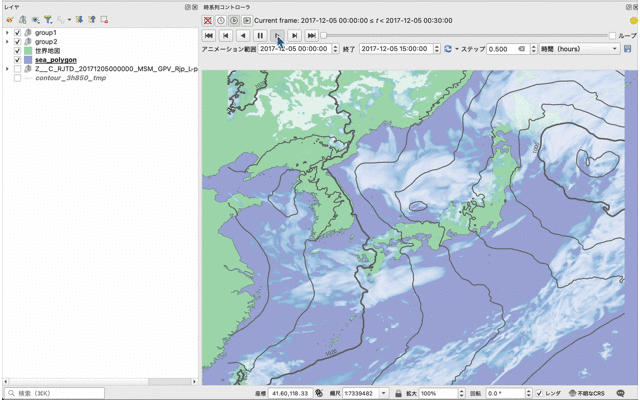
With the mesh layer, which this article did not cover in detail, you can also show wind direction and speed with wind barbs, for example (wind barbs are supported in QGIS 3.38 and later).

A later article will cover how to configure these.
Conclusion
This article showed the basic steps for opening JMA GPV data in QGIS and visualizing it. Some readers may assume that weather data requires difficult software or programming skills, but as this article shows, QGIS can visualize it easily.
Future articles will also introduce more advanced ways to represent weather data, so stay tuned!

QGIS LAB is a comprehensive information hub for QGIS, the open-source GIS software. Under the concept of “Geospatial for Greater Good,” we share the knowledge and skills to open up the world through location data.


