
Elevation Profile Tool: Usage and Examples
What you'll learn
- How to use the QGIS elevation profile tool
- Use cases for the QGIS elevation profile tool
Recommended for
- Anyone who wants to learn how to use the elevation profile tool
- Anyone who wants to visualize data as a profile in QGIS
Introduction
The elevation profile tool, a built-in feature since QGIS 3.26, is a handy way to create profiles from elevation data and other sources with little effort. It supports vector, raster, mesh, and point cloud data, so you can draw profiles of many kinds of data.
This article creates profiles from a variety of data.


How to use the elevation profile tool
Open the elevation profile tool from the menu bar by choosing View → Elevation Profile.

Before you use the tool, check Represents Elevation Surface in the properties of a layer that has height information, such as a digital elevation model (DEM).

Then draw a line on the map canvas, and the profile appears.

For the basics of the elevation profile tool, see also the YouTube video “Try Using the QGIS Elevation Profile Feature / QGIS Online Seminar.”
Creating profiles from various data
Here are profiles created from various types of data.
Terrain data
Elevation change along a river
This is the most basic use. It shows how the elevation changes along a river, using DEM data for Sapporo and line data for the Toyohira River.

Running the length of the Japanese archipelago
To run the length of the Japanese archipelago, this profile follows the Itoigawa-Shizuoka Tectonic Line from north to south.

In the north, toward Itoigawa, the elevation rises sharply a short distance from the coastline. In the south, toward Shizuoka, lowlands extend about 30 km inland from the coast.
Below is a 3D bird’s-eye view looking south from the Sea of Japan side (created with the Qgis2threejs Exporter plugin, with elevation exaggerated 10 times). Steep mountains do stand in a row right next to the coastline.

In winter, moist winds from the Sea of Japan hit this steep mountain range, which is also one reason for the heavy snowfall.
Japan’s largest caldera
Mount Aso in Kumamoto Prefecture is the best-known caldera, but Japan’s largest caldera is actually in Hokkaido. It is the Kussharo Caldera in Teshikaga, in eastern Hokkaido. It measures about 26 km across from east to west (Mount Aso is about 20 km). Here is its profile.

The profile clearly captures Nakajima, the island in the caldera lake, Mount Atosanupuri to the southeast, and the Mashu Caldera, which forms Lake Mashu next to the Kussharo Caldera. For reference, here is the area in a 3D bird’s-eye view (elevation exaggerated 5 times).

Point cloud data
Next is a profile of point cloud data.
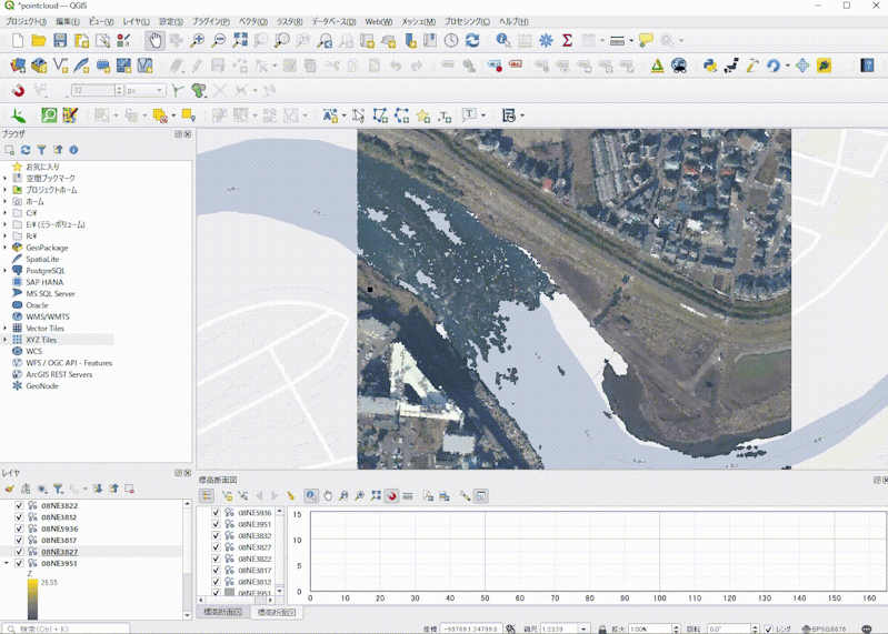
This example uses the VIRTUAL SHIZUOKA Shizuoka Prefecture Point Cloud Data (Southeast of Mt. Fuji and Eastern Izu) published by the G-Spatial Information Center. Try it with your own data as well.
First, view the point cloud data in a 3D view. It shows a river, a bridge, and buildings spreading along the riverbank.

Open the elevation profile tool, then use Capture Curve to draw a line that goes around the buildings and crosses the bridge. Set the symbology by Z value, coloring high elevations yellow and low elevations blue. To show the elevation relationships accurately, the profile also includes a DEM as a gray fill.

If the data also captures the riverbed, you can check the cross section of the river, which makes simple surveying possible.
Seafloor topography
Next is a profile of seafloor topography. The seafloor elevation data comes from the General Bathymetric Chart of the Ocean.
The equator
To start, this profile cuts the Earth in two along the equator.

Although the topic is seafloor topography, this data also includes land elevations, so you can see land and seafloor together. The pixel size is about 30 arc-seconds (about 1 km near the equator), which is too coarse to show fine features such as the continental shelf, so the edges of the continents look like clean cliffs. On the west side of South America, the northern part of the Andes forms a “wall” more than 4,000 m high.
Seen this way, the seafloor is incomparably more rugged than the continents. Perhaps that shows how much weathering and erosion act on the land surface.
Atmospheric pressure patterns
Profiles are not limited to terrain. Next is a profile of weather data. This one shows surface pressure at 3:00 a.m. on February 6, 2024. A few hours earlier, a low-pressure system passed south of Japan and brought snow to Tokyo (“Kanto: Worst of the Heavy Snow Is Over, but Snow and Rain Continue Until Around Noon on the 6th, with Highs Around 5°C and Severe Cold”, from tenki.jp).

This one is a profile of the north-south component of wind speed at the 850 hPa level at the same time. (*The data was obtained from the “GPV Data Archive” provided by the Data Integration and Analysis System (DIAS) and processed.) In areas where the value is 0 or above, a south wind (blowing toward the north) is blowing, and in areas where it is 0 or below, a north wind (blowing toward the south) is blowing. The profile shows clearly that the north wind is strong on the west side of the low-pressure system and the south wind is strong on the east side (the arrows in the figure show the approximate wind direction).

Warm, moist wind from the south met cold wind from the north. That probably helped the low-pressure system develop further and made it easier for cold air to move in, which seems to be one of the reasons the area was hit by snow.
Population along the Tokaido Shinkansen
Profiles are not limited to raster data. The tool can also show high and low values based on the numeric attributes of vector data.
The next figure is a profile of the population along the Tokaido Shinkansen. The population data is a mesh of polygons, and an attribute of each polygon holds the resident population of that mesh cell. The profile plots those values along the line data for the Tokaido Shinkansen railway (*The population data is the 2020 Population Census third-level mesh population from e-Stat, and the Shinkansen track line data is from National Land Numerical Information. Both were downloaded and processed.).

Population is naturally high near the metropolitan areas of Osaka, Nagoya, and Tokyo. Next time you ride the Shinkansen, it can be fun to compare the scenery outside with these differences in population density.
Bird flight altitude
Some research attaches GPS devices to birds to study their behavior. If the GPS also records altitude, you can show a bird’s flight altitude in a profile.
The next figure uses GPS data from a Northern Pintail. The bird moved from the Tohoku region of Japan to Hokkaido and then Sakhalin, ending at the Kamchatka Peninsula (the data was obtained from Movebank and processed). In the profile, the brown area is land, and the green line is the height recorded by the GPS on the pintail. In the figure, A-B is the flight from the Tohoku region of Japan to northern Hokkaido, B-C is the flight across the Soya Strait to Sakhalin, C-D is the movement within Sakhalin, and D-E is the flight from Sakhalin across the Sea of Okhotsk to the Kamchatka Peninsula.
Over land, the flight height generally follows the terrain, and over the sea the bird does not fly very high. (Note that a GPS record does not always mean the bird is in flight. It may have landed on the water to rest or feed, so interpret the data with care.)
Showing the data this way may make it easier to understand how the bird moved.

Bonus
Finally, a quiz. What data does the following figure show a profile of? Give it some thought.
- Hint 1: The profile shows the elevation along a route. The full length of the route is about 1,100,000 m (=1,110 km).
- Hint 2: Where no profile is drawn, the elevation is 0 m. So what could it be? ...

Answer
The answer: an elevation profile along the flight route from Haneda Airport to New Chitose Airport. A MIERUNE team member recorded the route with GPS on a flight home to Sapporo from Tokyo. Shown together with a map, it looks like this.

The area without a profile just after takeoff is Tokyo Bay, and the area without a profile just before landing is the Tsugaru Strait. The mountainous area above 1,000 m in between is northern Fukushima Prefecture, the mountains of the Azuma range and the Ou Mountains. If you also display the GPS track points on the profile, you can see the flight altitude from takeoff to landing, as in the figure.
Conclusion
Although the tool is called Elevation Profile, it can show profiles of many kinds of data besides elevation data. Drawing a profile lets you see the data in a different way.
Try creating profiles from various kinds of data yourself.

QGIS LAB is a comprehensive information hub for QGIS, the open-source GIS software. Under the concept of “Geospatial for Greater Good,” we share the knowledge and skills to open up the world through location data.


